Designing a Page
difference from free layout
Elements can only be placed inside grids on the canvas.
- Click
 to add a page in grid layout, double-click or point to the page, and then click
  at the upper-right corner to start page design.
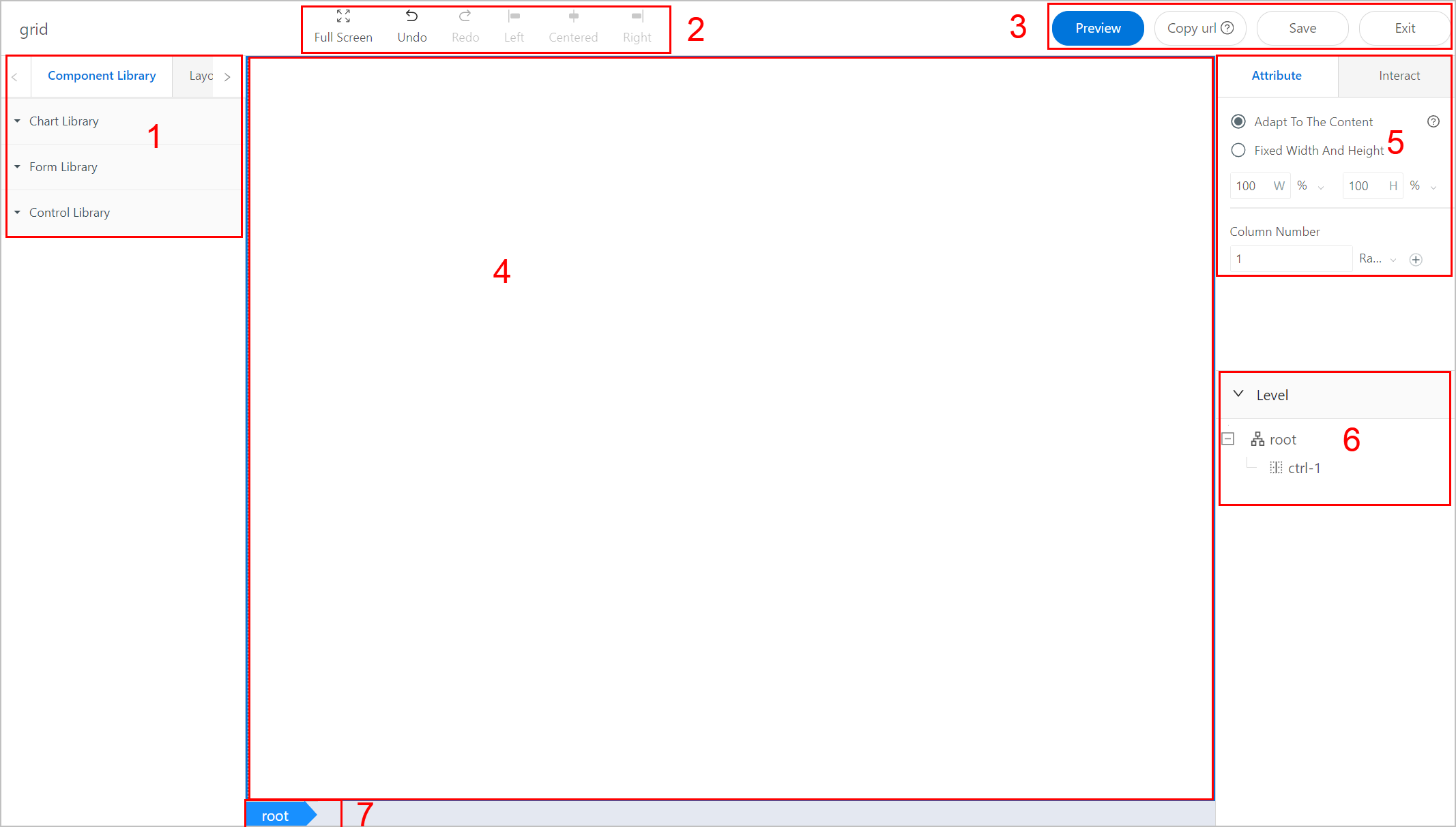
| No. | Module | Description |
|---|---|---|
| 1 | Element Library |
|
| 2 | Development Tools | Displays tools you can use during designing.
|
| 3 | Page Operations | Preview and save the current page, copy the page URL for use in scripts, and exit page designing. |
| 4 | Canvas | The place where you design your application. |
| 5 | Attribute | Set canvas properties to achieve effects you need. |
| 6 | Level | Indicates hierarchical relations among added elements or layouts. You can quickly select elements on the list. |
| 7 | Bread Crumb | Displays the selected layout block path. |
- Click on the canvas, and edit canvas attributes as needed.
- Root block attributes
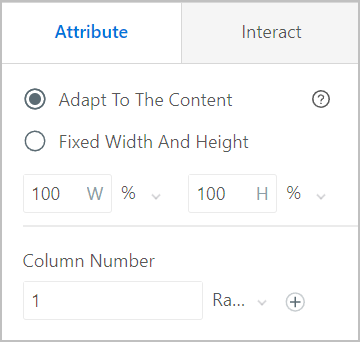
- Adapt To The Content: Canvas size adjusts according to content and element size.
- Fixed Width And Height: Select it and set the width and height of the canvas. Unit can be percentage or pixel.
- Number of Columns: Set the number of columns on the canvas. Click
 to add or delete columns.info
Select units of columns from Ratio and Pixel, the supOS platform arranges the width of each column based on units and number of columns.
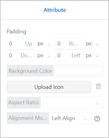
- Sub-block attributes
You can set the padding, background color and image of the grid, background image display and elements alignment inside the grid.
- Select Layout Library, and drag Grid or Block onto the canvas to build various layouts.
- Layout block attributes
info
Layout block is under Layout Libray.
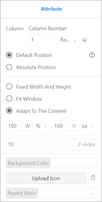
| Parameter | Description |
|---|---|
| Column Number | Enter the number of columns inside the block. You can select different units of each column. |
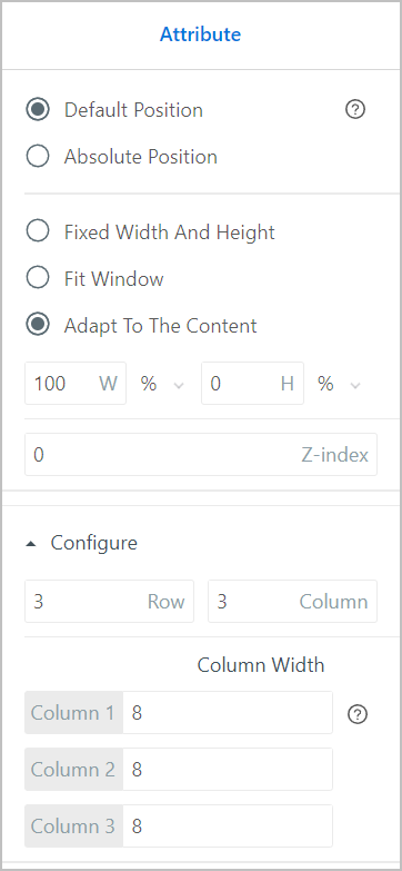
| Default Position | The block is at the upper-left corner of the column and adapts to screen resolution. |
| Absolute Position |
|
| Fixed Width And Height | Set block size and when content is larger than the size, scroll bars are displayed. |
| Fit Window | Block size is the same as the left area of its parent block. |
| Adapt To The Content | Block size adjusts according to content and element size. You need to set the width and height of elements inside the block. |
| Display Level | Set the display level (Z-index) of the block. The higher the level, the more front it is displayed. |
| Background Color | Set the block background color. |
| Upload Icon | Upload an image to be the block background image. |
| Aspect Ratio | Select the background image display.
|
 to move it anywhere inside the column.
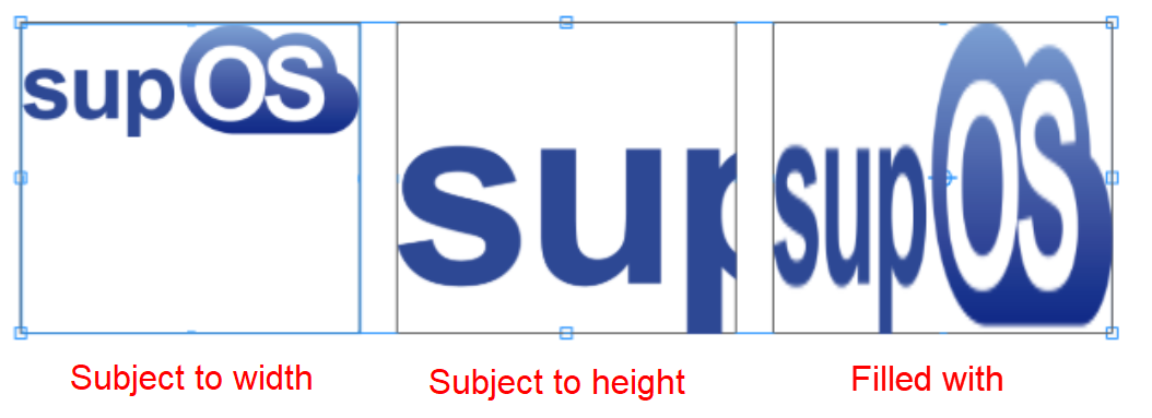
- Layout grid attributes
info
Layout grid is under Layout Libray.
You can set rows and columns of the grid, and set the width of each column.
- Under Element Library, drag and drop elements into the layout blocks you set based on your design requirements.
- Click Save and Exit to finish design.